
[ Prototyping Research ] Lost Alphabets of Louis John Pouchée #1
Assessment content Practice-based work (30%): In-class design and prototyping work documented through weekly reflections. Investigate Louis John Pouchée's alphabet and create a 1 minute 45 second motion graphic

Louis John Pouchée(1782-1845)
He is an English type foundry, founded a London type foundry in 1818, employed skilled typographers, and sold his type below market prices. So Louis John Pouchée's type was produced in the early 19th century.
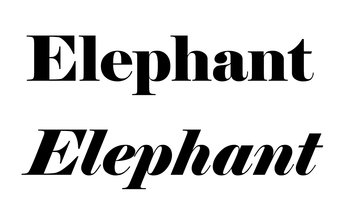
Popularization of his design and Fat Face typeface
In the early 19th century, Louis John Pouchée's alphabet designs were widely known, primarily in England. At the time, Fat Face-style bold serif typefaces were popular for their catchy designs, often used in advertisements and headlines. Notable typographers, particularly Robert Harling and Nicolete Gray, helped popularize this style.
Fire and Loss of the Alphabet
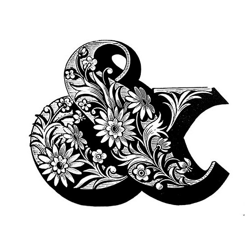
There is something suspicious about his story. It was a fire in the London office in 1936. It is believed that the entire alphabet of Louis John Pouchée was lost in a fire, and the cause of the fire is not clear. The collection, which included 3 tons of punch and 23 alphabets carved into boxwood, was lost and took 30 years to be reviewed. It is certain that the work was lost in the fire, but the cause has not yet been determined.
Restoration and preservation of the alphabet
Parts of the Pouchée alphabet that survived from the 1960s were moved to the University Press in Oxford and, after subsequent restoration work, moved to the St Bride Printing Library in London for preservation. At the time, it was thought that the alphabet was all lost in a fire, but some of the alphabets were moved to other places and preserved. Subsequent efforts and research made possible the recovery of Pouchée's alphabet collection, which the St Bride Printing Library preserves and serves as a versatile inspiration for designers, typographers and artists.
Republishing the Pouchée alphabet for the digital age
Acclaimed typographer and designer James Clark has been tasked with republishing his fonts for the digital age. Inspired by the intricate beauty and ingenuity of ornamental typefaces, Clark saw the potential to revive them and reintroduce them to a modern audience.
And today,
Republished by James Clark in today's digital world, Pouchée's alphabet is faithful to the original reproduction and fits harmoniously into the graphic design. Pouchee's fonts have been a source of inspiration, displaying timeless beauty and generational creativity.
References : Louis John Pouché’s Lost Alphabets Are the Most Beautiful Types Ever - TypeRoom Jamie Clarke Type